Chapter 5: Widgets Reference
Documentation for all 48 available widgets in PageGenius: what each does, properties, usage tips, and common problems.
Index by Category
| Category | Widgets |
|---|---|
| Layout & Structure | Header, Footer, Container, Columns, Divider, Spacer, Custom Code |
| Hero & Media | Hero, Hero Carousel, Video Hero, Image, Video, Gallery, Masonry Grid, Portfolio Grid, Before/After |
| Text & Content | Heading, Text, Button, Text Scramble, Marquee, Logos, Logo Carousel, Carousel |
| Business & Conversion | Features, Services, Services Detailed, Pricing, Testimonials, Testimonial Carousel, Video Testimonial, FAQ, Team, Stats, CTA, Contact Form, Lead Magnet, Appointment Booking, Map, Social, Trust Badges, Emergency Banner, Chat Widget, Countdown |
| Animations & Effects | Animated Section, Scroll Reveal, Tilt Card |
Widgets in the builder: 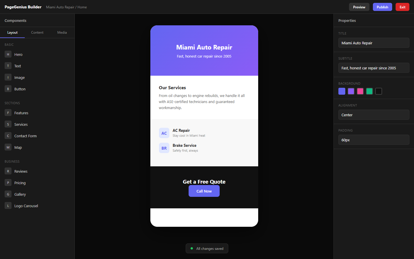
Example published services page: 
Layout & Structure
Header
What it does: Top navigation bar with logo, page links, and CTA button.
Key props:
- Logo: Image or text
- Links: Array of page links (auto-generated from page tabs)
- CTA Button: Text and link of the main button
- Sticky: Whether it stays fixed when scrolling
- Background: Color or transparent
Tips:
- The header is automatically rendered on all published pages. You don't need to add it manually to each page.
- To change the logo across the whole site: go to Settings → Branding.
Common problem: "My header doesn't appear on the live site"
- Solution: The header is auto-injected on publish. You don't need to put it on the builder canvas. If you want a custom header, use the Custom Code widget.
Footer
What it does: Bottom bar with links, copyright, social media, and contact info.
Key props:
- Columns: 1-4 columns with links or text
- Copyright: Copyright text
- Social Links: Social media icons
- Logo: Footer logo (can be different from header)
Tips:
- Like the header, it's auto-rendered on all published pages.
- To edit footer content: Settings → Branding → Footer.
Common problem: "The footer has broken links"
- Solution: Check that the pages exist. Links are auto-generated from page tabs. If you deleted a page, the link stays broken until you republish.
Container
What it does: Box container that can hold other widgets inside (nestable).
Key props:
- Background: Color or image background
- Padding: Inner spacing
- Border: Border radius (rounded corners)
- Width: Full, container, or custom
- Alignment: Center, left, right
Tips:
- Use it to group related widgets and give them a common background.
- Ideal for "features" or "services" sections with a light gray background.
Common problem: "Widgets inside the container don't show"
- Solution: Make sure you dragged widgets INSIDE the container (a dashed border appears when you're over it).
Columns
What it does: Divides the canvas into 2, 3, or 4 columns. Each column is an independent DropZone.
Key props:
- Column count: 2, 3, 4
- Gap: Space between columns
- Responsive: On mobile they stack vertically automatically
Tips:
- Ideal for "features" (3 icons + text side by side).
- On mobile, columns stack in left-to-right order.
Common problem: "On mobile the columns are too narrow"
- Solution: This is normal. The responsive design stacks columns. If you want them to stay side by side on mobile, use Container instead of Columns.
Divider
What it does: Horizontal separation line.
Key props:
- Color: Line color
- Thickness: Width (1px, 2px, 3px)
- Width: Full, 50%, 25%
- Style: Solid, dotted, dashed
Tips:
- Use it between sections to give visual "air".
- A subtle divider (1px, light gray, 50% width) looks more professional than a thick black one.
Spacer
What it does: Empty vertical space.
Key props:
- Height: In pixels (20px, 40px, 80px, etc.)
Tips:
- Use it to separate sections without adding a visible line.
- On mobile, spacing is automatically reduced.
Custom Code
What it does: Allows injecting custom HTML, CSS, or JavaScript.
Key props:
- Code: The HTML/JS/CSS code
- Position: Inline (in body), Head (inside <head>), or Body End (before </body>)
Tips:
- Use with care. Bad code can break your site.
- Ideal for: tracking scripts (Facebook Pixel, Google Tag Manager), third-party widgets (chat), or very specific CSS styles.
Common problem: "I added code and the site looks broken"
- Solution: Delete the Custom Code widget, save, and republish. Check your code for unclosed tags (
<div>without</div>).
Hero & Media
Hero
What it does: Main page section. Big title, subtitle, button, and background.
Key props:
- Title: Main headline
- Subtitle: Description
- Button Text / Link: CTA
- Variant: Gradient Blue, Gradient Dark, Gradient Warm, Clean White, Image Overlay
- Background Image: (for variants that use it)
- Align: Left, Center, Right
Tips:
- The title should answer: "What do you do and for whom?" E.g.: "Miami Auto Shop Specialized in Brakes"
- Use Image Overlay if you have a real photo of your business.
Common problem: "Hero text is unreadable over the image"
- Solution: Switch to "Gradient Dark" or "Image Overlay" variant, which adds a dark overlay automatically. Or upload an image with a clear center area.
Hero Carousel
What it does: Hero slider. Multiple slides with image, title, subtitle, and CTA.
Key props:
- Slides: Array of slides (image, title, subtitle, button)
- Auto-play: Whether it changes automatically
- Interval: Time between slides (seconds)
- Show Arrows/Dots: Visible navigation
Tips:
- Ideal for businesses with multiple highlighted services (e.g.: "Emergency Service", "Preventive Maintenance", "Extended Warranty").
- Don't use more than 3-4 slides. People won't wait for the 5th.
Common problem: "Carousel images look distorted"
- Solution: Use images with the same aspect ratio (16:9 recommended). Minimum 1920x1080px.
Video Hero
What it does: Hero with background video (autoplay, mute, loop).
Key props:
- Video URL: YouTube, Vimeo, or MP4 file link
- Title / Subtitle: Overlay text
- Overlay Opacity: How dark the filter over the video is
- Button: CTA
Tips:
- Video must be muted (browser policy).
- Only use if you have a professional 10-15 second video. Long videos slow down loading.
Common problem: "Video doesn't play on mobile"
- Solution: On iOS, background videos sometimes don't autoplay. Make sure the video is hosted on a fast CDN (not a slow server).
Image
What it does: Simple image block.
Key props:
- Image: Upload or pick from Media
- Alt Text: Alternative text (SEO and accessibility)
- Caption: Caption below
- Link: If clickable, where it goes
- Border Radius: Rounded corners
- Shadow: Shadow
Tips:
- Always fill in the Alt Text. Helps Google and visually impaired people.
- Use WebP whenever possible. PageGenius automatically converts JPG/PNG to WebP.
Common problem: "The image looks pixelated"
- Solution: Upload a larger image. The builder scales it, but doesn't improve it. Minimum 1200px width.
Video
What it does: Embedded video (YouTube, Vimeo, or direct file).
Key props:
- Video URL: Video link
- Autoplay: Auto-play
- Controls: Show control bar
- Mute: Start without sound
- Width: Full container or fixed size
Tips:
- For video testimonials, use this widget instead of uploading heavy files.
- YouTube is lighter than self-hosted MP4 files (uses their global CDN).
Gallery
What it does: Image grid with lightbox (click to enlarge).
Key props:
- Images: Array of images
- Columns: 2, 3, 4, or masonry
- Gap: Space between images
- Border Radius: Rounded corners
- Click to enlarge: Opens lightbox
Tips:
- Ideal for: roofing portfolios, before/after renovations, restaurant galleries.
- Upload all images in the same aspect ratio for a uniform grid.
Common problem: "Gallery looks messy"
- Solution: Use "Masonry" option for images with different proportions, or make sure all have the same aspect ratio.
Masonry Grid
What it does: Pinterest-style grid. Images of different sizes fit like bricks.
Key props:
- Images: Array
- Columns: 2, 3, 4
- Gap: Spacing
Tips:
- Perfect for Instagram-style galleries or creative portfolios.
- Images are automatically ordered to minimize empty spaces.
Portfolio Grid
What it does: Grid of projects/work with title, description, and image.
Key props:
- Items: Array of works (title, description, image, link)
- Columns: 2, 3, 4
- Hover Effect: Effect on mouse hover (zoom, overlay, etc.)
Tips:
- Ideal for: construction, design, or photography portfolios.
- Add a link to each item to show more details.
Before/After
What it does: Before/after comparison slider.
Key props:
- Before Image: "Before" photo
- After Image: "After" photo
- Label Before/After: Text over each photo
- Slider Position: Where the divider starts (default: 50%)
- Direction: Horizontal or vertical
Tips:
- Use it for: renovations, cleaning, dental treatment results, car painting.
- Both photos MUST be aligned (same angle, same distance).
Common problem: "Images don't align"
- Solution: Take photos from the same spot. If they don't align, the effect looks amateur.
Text & Content
Heading
What it does: H1, H2, or H3 title.
Key props:
- Text: The title
- Level: H1, H2, H3
- Color: Text color
- Size: Font size
- Align: Left, Center, Right
Tips:
- Use H1 only once per page (the hero usually already has the H1). The rest should be H2/H3.
- Google uses headings to understand your content structure.
Text
What it does: Rich text paragraph.
Key props:
- Content: The text (supports bold, italic, lists, links)
- Color: Text color
- Size: Font size
- Line Height: Line spacing
- Max Width: Maximum block width
Tips:
- Don't write walls of text. Paragraphs of 2-3 lines read better.
- Use bold to highlight keywords (helps SEO).
Button
What it does: Clickable button.
Key props:
- Text: What the button says
- Link: Where it goes (URL,
tel:+123,mailto:, or internal page) - Variant: Primary, Secondary, Outline, Ghost
- Size: Small, Medium, Large
- Width: Auto or Full width
- Icon: Optional icon (arrow, phone, etc.)
Tips:
- Button text should be an action: "Call Now", "Book Appointment", "Get Quote". NOT "Submit" or "Click Here".
- For phone calls, use
tel:+1234567890as the link.
Common problem: "The button doesn't go anywhere"
- Solution: Check that the Link field isn't empty. For WhatsApp, use
https://wa.me/1234567890.
Text Scramble
What it does: Text that appears with a "decryption" effect (letters scramble until forming the final word).
Key props:
- Text: Final text
- Speed: Effect speed
- Trigger: On load, on scroll, on hover
Tips:
- Use it for eye-catching headlines on startup or creative pages.
- Don't use it on traditional local business sites (it might seem "too modern").
Marquee
What it does: Text or images scrolling horizontally in a loop.
Key props:
- Items: Array of texts or images
- Speed: Scroll speed
- Direction: Left or right
- Pause on hover: Stops on mouse hover
Tips:
- Ideal for: client logos, certifications, or repeated trust phrases.
- Don't put critical text here (people won't read it completely).
Logos
What it does: Grid of client/brand logos.
Key props:
- Logos: Array of images (client logos)
- Grayscale: Whether they start gray and color on hover
- Columns: 2, 3, 4, 5, 6
Tips:
- Use it to show "Companies that trust us".
- Logos should have transparent backgrounds (PNG) to look good on any background.
Logo Carousel
What it does: Auto-scrolling carousel of logos.
Key props:
- Logos: Array of images
- Speed: Speed
- Direction: Left or right
- Pause on hover: Stops on mouse hover
Tips:
- Use it if you have many logos (more than 6). If you have few, use the static Logos widget.
Carousel
What it does: Generic image/content carousel.
Key props:
- Slides: Array of slides (image, title, description)
- Auto-play: Auto-play
- Arrows / Dots: Navigation
- Effect: Slide, fade, cube, coverflow
Tips:
- Use it for: product galleries, featured projects, or services with images.
Business & Conversion
Features
What it does: Grid of features/services with icon, title, and description.
Key props:
- Features: Array (icon, title, description)
- Columns: 2, 3, 4
- Icon Style: Outlined, filled, colored
- Background: Section background color
Tips:
- Ideal for the "Why choose us?" section.
- Use icons that make sense (not generic). E.g.: for an auto shop, use tool icons, not "rockets".
Common problem: "Icons don't show"
- Solution: Check that the icon isn't transparent on a transparent background. Change the section background or icon color.
Services
What it does: List of services with title and brief description.
Key props:
- Services: Array (title, description, icon, link)
- Layout: Grid or list
- Show icons: Yes/no
Tips:
- Keep descriptions short (1-2 sentences). If you want more detail, use Services Detailed.
- Add a link to each service if you have a dedicated page.
Services Detailed
What it does: Expanded services with image, long description, price, and CTA.
Key props:
- Services: Array (title, description, image, price, button)
- Layout: Card or accordion
Tips:
- Ideal for "Services" pages where each service needs explanation.
- Price is optional. If you don't want to show prices, leave the field empty.
Pricing
What it does: Pricing table/plans.
Key props:
- Plans: Array (name, price, period, features, button, highlighted)
- Highlight: One plan can be marked as "Recommended"
- Currency: $, €, £, etc.
Tips:
- Mark as "Recommended" the plan you want to sell the most.
- Use round numbers: "$99/mo" reads better than "$97.50/mo".
Common problem: "Pricing table looks bad on mobile"
- Solution: On mobile, pricing columns stack vertically. If you have more than 3 plans, consider showing only 2.
Testimonials
What it does: Grid of customer testimonials (text, name, photo).
Key props:
- Testimonials: Array (quote, name, role, photo, stars)
- Columns: 1, 2, 3
- Show stars: 1-5 star rating
Tips:
- Use real photos of clients (not stock photos). Increases trust by 300%.
- If you don't have photos, initials with a colored background are auto-generated.
Testimonial Carousel
What it does: Testimonial slider.
Key props:
- Testimonials: Array
- Auto-play: Auto-changes
- Show dots/arrows: Navigation
Tips:
- Ideal if you have more than 4 testimonials. If you have few, use static Testimonials.
Video Testimonial
What it does: Testimonial with embedded video (YouTube/Vimeo).
Key props:
- Video URL: Video link
- Name / Role: Who gives the testimonial
- Quote: Highlighted text from the video
Tips:
- Video should be short (30-60 seconds).
- Add the most impactful quote as text, so people who don't watch the video still read something.
FAQ
What it does: Accordion-style frequently asked questions (click to expand).
Key props:
- Questions: Array (question, answer)
- Style: Simple, card, or numbered
- Open first: Whether the first question starts open
Tips:
- Add the 5-8 most common questions. No more.
- Include prices, hours, service areas, and warranties.
- PageGenius generates Schema.org FAQPage automatically from this data (helps SEO).
Team
What it does: Team member cards (photo, name, role, bio).
Key props:
- Members: Array (name, role, bio, photo, social links)
- Columns: 2, 3, 4
- Show social: LinkedIn, Twitter, etc. icons
Tips:
- Ideal for "About" or "Team" pages.
- Photos should be professional and in the same style (same background or lighting).
Stats
What it does: Highlighted numbers bar (years of experience, satisfied customers, etc.).
Key props:
- Stats: Array (number, label, suffix)
- Animation: Animated counter on scroll
- Columns: 2, 3, 4
Tips:
- Use concrete numbers: "15 years", "2,340 clients", "98% satisfaction".
- Suffix can be: +, %, k, M.
CTA (Call to Action)
What it does: Conversion banner. Title, subtitle, and big button.
Key props:
- Title: Persuasive headline
- Subtitle: Description
- Button: Text and link
- Background: Color or image
- Align: Left, Center
Tips:
- Use it at the end of every page (before the footer).
- The title should be an action: "Book your appointment today", "Call for your free quote".
Contact Form
What it does: Contact form with validation.
Key props:
- Fields: Array (name, email, phone, message, service of interest)
- Submit Button: Button text
- Success Message: What it says after submitting
- Redirect URL: Where it goes after submitting (optional)
Tips:
- Don't ask for too many fields. Each extra field reduces conversions by 10%.
- Minimum recommended: Name + Email + Message.
- The form is sent to your email automatically. It's also saved in Leads.
Common problem: "I don't receive form emails"
- Solution: Check spam/promotions. If you use Gmail, search for "PageGenius". The sender is
[email protected].
Lead Magnet
What it does: Email capture box in exchange for something free (ebook, discount, checklist).
Key props:
- Title: What you're offering
- Description: Benefit
- Button: "Download Free", "Send me the PDF"
- Success: Post-submission message
- File URL: Link to the file you're "giving away" (optional)
Tips:
- Use it to build a list of prospect emails.
- Offer something of real value: "Guide: How to Choose a Miami Dentist" or "Checklist: 10 Points Before Hiring a Roofer".
Appointment Booking
What it does: Appointment widget with date/time selector.
Key props:
- Service: Service to book
- Duration: Appointment duration
- Available Days/Hours: When you're open
- Timezone: Time zone
Tips:
- Ideal for: dentists, mechanics, clinics, salons.
- If you don't use an external calendar (Calendly, Acuity), the widget sends an email with the request and you confirm manually.
Common problem: "Dates don't match my schedule"
- Solution: Check Available Hours and Timezone settings.
Map
What it does: Embedded Google Maps.
Key props:
- Address: Full address
- Zoom: Zoom level
- Height: Map height
- Marker Label: Pin text (e.g., "Our Shop")
Tips:
- Use a real address (not PO Box). Google needs exact coordinates for local SEO.
- The map loads lazily (only when the user scrolls to it), so it doesn't slow down the page.
Social
What it does: Social media icons bar.
Key props:
- Links: Array (platform, URL)
- Platforms: Facebook, Instagram, LinkedIn, Twitter/X, YouTube, TikTok, WhatsApp
- Size: Small, Medium, Large
- Style: Colored, monochrome, circle
Tips:
- Only show networks you ACTUALLY update. An abandoned Instagram gives a bad impression.
- WhatsApp is the most important social network for local businesses. Make sure you have it.
Trust Badges
What it does: Row of trust icons (SSL, Warranty, Insured, etc.).
Key props:
- Badges: Array (icon, text)
- Layout: Horizontal or grid
Tips:
- Use it near the contact form or purchase/booking button.
- Examples: "1-year warranty", "Insured", "Licensed", "5 stars on Google".
Emergency Banner
What it does: Urgent banner at the top of the page.
Key props:
- Text: Emergency message
- Link: Where it goes
- Style: Urgent Red, Dark Alert, Gradient, Minimal
- Dismissible: Whether the user can close it
Tips:
- Use it for: "24h Emergency Service — Call now", "Limited offer until Friday", "Closed for renovation — Reopening on the 15th".
- Don't leave it permanently. The banner loses effectiveness if it's always there.
Chat Widget
What it does: Floating chat bubble (WhatsApp, Messenger, or custom script).
Key props:
- Platform: WhatsApp, Messenger, Custom
- Phone/ID: WhatsApp number or Messenger ID
- Message: Pre-written text when opening
- Position: Bottom-left or Bottom-right
- Color: Bubble color
Tips:
- WhatsApp is the most popular option for local businesses.
- The number must include country code without
+or00. E.g.:13051234567.
Common problem: "Chat doesn't open WhatsApp"
- Solution: Check that the number doesn't have
+, spaces, or00. E.g.:13051234567(not+1 305 123 4567nor0013051234567).
Countdown
What it does: Animated countdown timer.
Key props:
- Target Date: Target date and time
- Labels: Days, Hours, Minutes, Seconds
- Style: Modern, Classic, Minimal
- Expired Message: What it says when it reaches zero
Tips:
- Ideal for: limited promotions, launches, events.
- The countdown works in real-time (no need to refresh the page).
Animations & Effects
Animated Section
What it does: Container that applies animations to the widgets inside it.
Key props:
- Animation: Fade, Slide Up, Slide Left, Zoom, Flip
- Trigger: On scroll (when it enters the screen) or On load
- Duration: Animation speed
- Delay: Delay before starting
Tips:
- Use moderately. Too many animations distract.
- Ideal for: features sections, testimonials, stats.
Scroll Reveal
What it does: Applies scroll reveal animations (applied to other widgets).
Key props:
- Effect: Fade, Slide, Zoom
- Threshold: How visible it must be before animating
Tips:
- It's a wrapper. Drag widgets inside it.
Tilt Card
What it does: Card with 3D tilt effect on mouse hover.
Key props:
- Max Tilt: Maximum tilt degrees
- Scale: Zoom on hover
- Glare: Light reflection effect
Tips:
- Use it for: service cards, pricing, or team members.
- Don't use it on mobile (doesn't make sense without a mouse).
Chapter 5 Summary
Most important widget: Hero — it's the first thing visitors see.
Most forgotten: Schema.org — not a visible widget, but PageGenius generates it automatically from Business Info.
Most useful for conversions: Contact Form + CTA combined.
Most problematic: Custom Code — if it breaks, it breaks the whole site.
| If you want to... | Use the widget... |
|---|---|
| Show services | Features or Services |
| Capture leads | Contact Form or Lead Magnet |
| Show work photos | Gallery, Before/After, or Portfolio Grid |
| Build trust | Testimonials, Trust Badges, Logos |
| Grab attention | Hero, Emergency Banner, Countdown |
| Navigation | Header (auto) + Map + Social |
Next chapter: Chapter 6: Publish and Custom Domains